Analytics is generally used on numeric data to gain insights. However, graph analytics analyzes relationships between entities rather than numeric data.
Using graph algorithms and relationships in graph databases, graph analytics solutions uncover insights in fields like social network analysis, fraud detection, supply chain, and search engine optimization. Explore graph analytics, types, and tools with use cases!
| Industry/Sector | Specific Application | Key Insight |
|---|---|---|
| Journalism | Identifying networks of relationships | Uncovering hidden connections (e.g., Panama Papers) |
| Compliance | Spotting fraud, criminals, and unlawful actions | Detecting money laundering and illicit activities |
| National Security | Analyzing communication activities | Identifying and disrupting unlawful networks |
| Operations | Optimizing routes in supply chains | Improving efficiency and distribution networks |
| Marketing | Social network analysis; Recommendation engines | Identifying influencers; Delivering targeted product suggestions |
| Healthcare | Tracking the spread of infectious diseases | Monitoring outbreaks and predicting disease progression |
Types of Graph Analytics
- Centrality analysis: Centrality measures identify the graph’s most important or influential nodes. Examples include degree centrality, closeness centrality, and betweenness centrality, commonly used in social network analysis and influencer detection.
- Graph Traversal: Traversal algorithms, such as Depth-First Search (DFS) and Breadth-First Search (BFS), are used to explore all nodes in a graph and identify patterns or anomalies. It is particularly relevant in AI, pathfinding, and network diagnostics.
- Community detection: The distance and density of relationships can be used to identify groups of people who frequently interact with each other in a social network. Community analytics also deals with the detection and behavior patterns of communities.
- Connectivity analysis: Determine how strongly or weakly connected two nodes are.
- Path analysis involves finding the shortest, longest, or most optimal paths between nodes in a graph. It is often used in routing algorithms, supply chain logistics, and network optimizations.
Top 6 Use Cases for Graph Analytics
Graph analytics applications are utilized in various industries, including journalism, telecommunications, social networks, finance, and operations.
1. Journalism
A now-classic example of using graph analytics to identify networks of relationships is the International Consortium of Investigative Journalists (ICIJ) ‘s research on the Panama Papers. This research shed light on how authoritarian leaders and politicians used complex sets of shell companies to obscure their wealth from the public.
Armed with graph analytics and document extraction tools, journalists were able to get structured data from thousands of documents on companies in offshore jurisdictions and use graph analytics to navigate through the structured data in the documents to identify the real owners of these companies.
2. Compliance
Graph analytics are used to spot frauds or criminals and unlawful actions such as money laundering and payments to sanctioned entities. To detect criminals, analysts use the data of social media, texting, phone calls and emails to create a graph that shows how these data are related to criminals’ records. With that graph, government agencies can identify threats from non-obvious patterns of relationships.
- Financial transactions form graphs and can be analyzed for compliance reasons for example. Banks need to ensure that their customers are not in any way connected to sanctioned entities.
- Loan decisions can be made using social or financial networks.
3. National security
Though controversial, graph analytics is being used by national intelligence agencies to detect unlawful activity. Communication activities of both suspected and non-suspected individuals are collected and analyzed to identify non-obvious relationships and identify potential crimes.
4. Operations
Compliance
Financial entities are required to prevent payments to sanctioned entities and graph analytics are used to spot such payments.
Fraud detection
In businesses that work with networks such as telecom companies, e-commerce marketplaces or financial institutions, graph analytics is used in fraud detection.
In addition to traditional graph analytics platforms, cloud-based AI services are increasingly being used to extract insights from graph-structured data. For instance, Google Vertex AI enables teams to build and deploy machine learning models that incorporate graph-based features, such as node embeddings or relationship scores.
Supply Chain Optimization
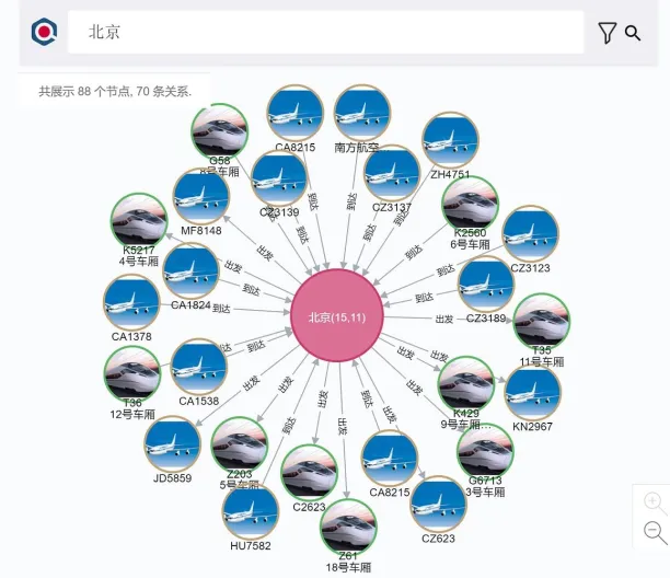
Graph analytics algorithms such as shortest path and partitioning are tools to optimize routes in airlines, transportation networks, and supply chain networks.
Utility optimization
Companies that provide utilities such as water, sewage services, electricity, dams, and natural gas can leverage graph analysis to build the most optimal utility distribution network.
5. Marketing
Social Network Analysis
Social media networks such as Instagram, Spotify and LinkedIn are relationship and connection driven applications. Graph analytics helps identify influencers and communities in social media networks. Social network influencer marketing is an emerging trend due to the increasing number of social media network users and increasing customer skepticism with more established forms of marketing.
Recommendation engines
You may have noticed social networks suggesting “People you may know” or “Songs you may like.” These recommendations rely on collaborative filtering, which is a method commonly used by recommendation engines. Collaborative filtering relies on graph analytics to identify similar users and enables personalized recommendations.
Technology companies that are not social networks also rely on collaborative filtering. For example, eBay provides the most relevant search results according to purchase history.
6. Healthcare
Pandemic Search
The world is facing a pandemic of COVID-19. Since the virus is known as highly infectious, using a graph database help governments track the spread of the virus. A company called We-Yun has built an application using the Neo4j graph database that allows Chinese citizens to check if they came in contact with a known carrier of the virus. The image below is a screenshot of the application that shows all known cases that are connected with the name.
What are the leading graph database software tools?
Graph database tools are required for advanced graph analytics. Graph databases connect nodes (representing customers, companies, or any other entity.) and create relationships (edges) in the form of graphs that can be queried by users. Some of the leading graph database software tools are:
- Neo4j: A popular graph database, Neo4j excels in handling large datasets and performing complex, real-time analytics.
- TigerGraph: Known for speed and scalability, it’s good for handling massive graphs and is commonly used in large enterprises.
- Amazon Neptune: A fully managed graph database from AWS, supporting both property and RDF graphs.
- Microsoft Azure Cosmos DB: A multi-model database service with graph database capabilities, supporting real-time data access.
- GraphX (Apache Spark): Part of the Apache Spark ecosystem, GraphX is optimized for large-scale graph computations, beneficial for big data environments.
- JanusGraph: An open-source, distributed graph database that scales well for large graphs.
- Linkurious: A tool for visualizing complex graph data, commonly used in fraud detection.
- Gephi: An open-source tool for data scientists, offering powerful graph visualization capabilities.
- ArangoDB: A multi-model database with graph, document, and key-value store support, suitable for versatile applications.
For example, Neo4j is available both as an open-source solution and through a commercial license for enterprises.
FAQ
What is a graph?
To understand graph analytics, we need to understand what a graph means. Graph is a mathematical term and it represents relationships between entities. Two elements make up a graph: nodes or vertices (representing entities) and edges or links (representing relationships). The study of graphs is also known as Graph Theory in mathematics.
What are the types of graphs?
There are different types of graphs:
Directed graphs: All edges are directed from one node to another. It is also called digraph or directed network. Directed graphs represent asymmetric relationships.
Undirected graphs: All edges are connected from one node to another, but the direction of the relationship is not drawn. It is also called an undirected network. Undirected graphs express symmetric relationships.
Weighted graphs: A weighted graph has numerical weights on its edges. Those weights are required for shortest-path problems and other analyses.
Cyclic graphs: A cyclic graph has a path from at least one node back to itself. A graph that does not contain a cycle is called acyclic.
What is Graph Analytics?
Graph analytics, also called network analysis, is the analysis of relations among entities such as customers, products, operations, and devices. Organizations leverage graph models to gain insights that can be used in marketing or, for example, for analyzing social networks.
Many businesses work with graphs. Some examples are:
Telecom operators operate fixed or mobile networks, which can be modeled as graphs.
Telecom customers talk to one another and these relationships form graphs.
What are the different types of graph analytics?
For each type of graph analytics, there are numerous graph analytics algorithms including both simple heuristics and computationally intensive algorithms aimed at finding perfect solutions. Depending on the value of the solution, different algorithms can be implemented.
Why is it important now?
Graph analytics is important due to the expected market growth. According to a recent graph analytics market report, the graph analytics market size was ~$600 million in 2019, and it is expected to reach ~$2.5 billion by 2024, at a Compound Annual Growth Rate (CAGR) of 34% during the forecast period.
How is it different than regular analytics?
Regular analytics relies on statistics, computer programming and operations research to uncover insights. Graph analytics uses graph specific algorithms to analyze relationships between entities. Clustering, partitioning, PageRank and shortest path algorithms are unique to graph analytics.
Graph databases, which are necessary for advanced graph analytics, are more flexible than relational database management systems (RDBMS). RDBMSs have rigid schemas and it is difficult to add new data relations to them. However, new data relationships can be added in a flexible manner in graph databases.
You can also check out our sortable and data-driven lists of analytics platforms. If you want to learn more about analytics, feel free to check our other articles about it:


Comments
Your email address will not be published. All fields are required.