Product analytics software equips product managers and marketing teams with detailed insights into customer behavior, user sessions, and user journeys.
By capturing real-time interactions and analyzing usage patterns, these tools reveal how features are adopted, where users drop off, and what drives engagement. This enables teams to make informed decisions based on evidence, resulting in enhanced product improvements and user experiences.
Discover the top 11 product analytics software, highlighting their key features and differentiating characteristics.
Top 11 product analytics software
| Vendor | Average rating | Starting price/month | Free trial | Free plan |
|---|---|---|---|---|
| Google Analytics | 4.6 from 7,912 reviews | N/A | N/A | N/A |
| Amplitude | 4.5 from 2,297 reviews | 49 | ❌ | ✅ |
| Pendo | 4.5 from 1,662 reviews | N/A | N/A | ✅ |
| Heap | 4.6 from 1,343 reviews | N/A | N/A | ✅ |
| Mixpanel | 4.4 from 1,302 reviews | 24 | ❌ | ✅ |
| Smartlook | 4.6 from 989 reviews | 60 | 14 | ✅ |
| Hotjar | 4.4 from 902 reviews | 43 | 15 | ✅ |
| Fullstory | 4.5 from 890 reviews | N/A | 14 | ❌ |
| Glassbox | 4.5 from 729 reviews | N/A | N/A | N/A |
| Userpilot | 4.6 from 572 reviews | 249 | 14 | ❌ |
| Quantum Metric | 4.6 from 294 reviews | N/A | N/A | N/A |
Sorting is based on the number of reviews gathered from B2B review platforms such as G2 and Capterra.
Differentiating features list for each vendor
| Vendor | A/B Testing | Session Replay | Heatmaps |
|---|---|---|---|
| Google Analytics | ❌ | ❌ | ✅ |
| Amplitude | ✅ | ✅ | ✅ |
| Pendo | ✅ | ✅ | ❌ |
| Heap | ✅ | ✅ | ✅ |
| Mixpanel | ✅ | ✅ | ❌ |
| Smartlook | ❌ | ✅ | ✅ |
| Hotjar | ✅ | ✅ | ✅ |
| Fullstory | ✅ | ✅ | ✅ |
| Glassbox | ✅ | ✅ | ✅ |
| Userpilot | ✅ | ✅ | ✅ |
| Quantum Metric | ✅ | ✅ | ✅ |
*Please note that we only included features that are native to the product. Features provided with third-party integrations are not shown.
Detailed evaluation of product analytics tools
Google Analytics
Google Analytics focuses on built-in automation where users can quickly access insights from their Analytics data, forecast customer behavior, and utilize advanced modeling tools:
- Predictive analytics: By leveraging Google’s machine learning models, Analytics analyzes data to forecast potential user actions, such as making purchases or canceling subscriptions. Users can then create targeted audiences based on these predictions to enhance conversions or improve retention.
- Automated insights: Analytics automatically identifies and highlights important insights from the data, such as key changes, emerging trends, and growth opportunities that users should consider.
- Quick answers: Users can ask questions in natural language via the search bar to quickly find the metrics, reports, or insights they need.
Real-life example:
Watchfinder, a luxury watch retailer, observed that fewer than 1% of their website visitors completed a purchase during their first visit. To address this, they collaborated with the agency Periscopix to implement a highly targeted remarketing strategy using Google Analytics.
They created 20 audience segments based on user behavior, such as time spent on the site, language, geographic location, and ISP information. They gave special attention to high-value audiences, like employees from major banks in London’s financial district.
This strategic approach allowed Watchfinder to personalize its marketing messages and reconnect effectively with potential buyers. Over the course of six months, the campaign delivered outstanding results and significantly improved its marketing efficiency.
Results:
- 1,300% return on investment (ROI) over six months.
- 13% increase in average order value (AOV).
- 34% decrease in cost per acquisition (CPA) compared to non-brand search campaigns.
- Best performance from users who spent more than 10 minutes on their first site visit without making a purchase.1
Amplitude
Amplitude Analytics is a product analytics tool designed to help businesses track and understand user behavior in real time.
Amplitude provides AI-powered features such as:
- Ask Amplitude: Allows users to instantly generate insights by asking plain-language questions, with large language models interpreting queries and creating visualizations.
- Data assistant: Automates data governance tasks like cleaning and organizing datasets.
- Intelligent monitoring: Uses machine learning to detect anomalies in product metrics and notifies teams of unexpected changes in user behavior.
- Predictions: Uses transformer-based models to forecast user behavior to help teams optimize campaigns and tailor strategies by segmenting users based on predicted actions.
- Personalized assistance: Simplifies complex analytics tasks, like cohort analysis or chart building, by offering AI-driven suggestions.
Amplitude’s Session Replay feature allows teams to visualize a user’s journey through a website or app by capturing interactions such as clicks, scrolls, and navigation. It recreates the experience in a video-like format, enabling businesses to see exactly how users engage with their product.
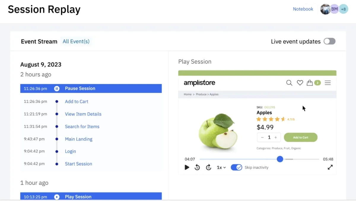
Figure 1: Amplitude’s session replay dashboard.2
Real-life example:
Ultra Mobile and Mint Mobile, two wireless carriers, faced the challenge of standing out in a competitive market. To enhance their digital customer experience and boost conversions, they utilized Amplitude’s analytics platform.
By tracking over 200 new customer data points, they gained more profound insights into user behaviors. This data-driven approach allowed them to personalize the customer journey effectively.
By implementing A/B testing and iterative refinements, they optimized their website and mobile app experiences, resulting in significant improvements in conversion rates.
Amplitude
Results:
- Tracked over 200 new customer data points to understand user behavior.
- Developed a personalization framework that enhanced the customer journey.
- Implemented A/B testing to refine website and app experiences.3
Pendo
Pendo AI enables the identification of workflow challenges and leverages AI-driven recommendations to enhance user navigation.
The platform also provides insights into user behavior, highlights opportunities for improvement, and offers automatic feedback summaries. Additional features include data standardization, content localization, analysis of NPS data, and visual data replays to provide context for user interactions and enhance the overall user experience.
Figure 2: Pendo product usage analytics dashboard.4
Real-life example:
Cox Automotive, an automotive services and technology provider, needed a faster and more efficient way to access product usage data and improve digital engagement with its dealer clients.
Previously, gathering product insights was a slow process, often taking weeks. After implementing Pendo across several of their platforms, including Manheim and Cox, they were able to surface detailed product data in real-time and use it to inform rapid decision-making.
Using Pendo’s in-app messaging capabilities, they personalized customer communications, replacing static tours with dynamic, targeted guidance based on user behavior and metadata. This personalized engagement helped dealers better understand and utilize Cox’s digital tools.
Additionally, a cross-functional governance team ensured Pendo was used strategically across departments like marketing, product, UX, and engineering, maximizing its impact across the organization.
Results:
- 39% increase in product activity through enhanced in-app engagement.
- Ability to retrieve year-long historical product data within minutes.
- Real-time targeting of in-app messages led to greater product adoption and usage.
- Over 40 new bidders were generated in a small pilot market through personalized campaigns.5
Heap
Heap’s CoPilot is designed to make analytics more accessible, regardless of a user’s experience level. It allows users to ask questions in plain language and provides analysis without the need for a complex setup.
CoPilot also generates automatic chart summaries for sharing and suggests follow-up questions to help users explore data more deeply. CoPilot is supported by Heap’s documentation and best practices and helps simplify the process of understanding and collaborating on data insights.
Figure 3: Chart summary generation by Heap CoPilot.6
Real-life example:
Atria Senior Living, which operates over 370 communities across the U.S. and Canada, sought a more advanced way to understand and optimize user behavior on its websites.
By collaborating with Heap, they automated data capture, enhanced user segmentation, and improved analysis of user journeys and conversion funnels.
Results:
- 9% increase in conversions from marketing pages.
- 2.6% increase in visits to job postings.
- Greater ability to track and analyze user behavior without manual event tagging.
- Faster identification of bottlenecks in user journeys.7
Mixpanel
Mixpanel’s Spark AI, powered by OpenAI, allows users to interact with product data using natural language processing, without needing to know SQL or specific data events. Key features of Spark AI include:
- Natural language querying: Users can ask product, marketing, or revenue questions and get visualized data insights.
- Follow-up prompts: To refine analysis and enable follow up, users can as additional questions.
- Report transparency: Users can see how visualizations were created by viewing the underlying data.
Spark AI allows users to ask objective, data-driven questions, such as “how many videos were watched in the last month?” or “break down this data by country.”
However, it does not handle subjective “why” questions, like “why are users purchasing fewer items this month?” Spark focuses on providing actionable insights from concrete data rather than interpreting user behavior or motivations.
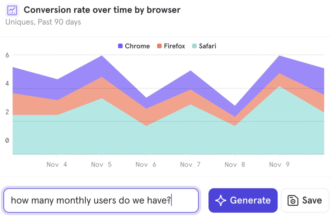
Figure 4: Mixpanel’s conversational AI dashboard.8
Real-life example:
Boll & Branch, a luxury home textiles brand, required more comprehensive insights to optimize its website and increase online sales.
Their previous analytics tool made data analysis complicated and time-consuming, limiting their ability to act swiftly on insights. Seeking a more user-friendly and efficient platform, they switched to Mixpanel.
With Mixpanel, they were able to quickly generate clearer visualizations, enabling even non-technical users to make data-driven decisions.
This improved their ability to enhance website features, personalize experiences, and ultimately boost online performance across key metrics.
Results:
- Increased add-to-cart rate.
- Improved overall conversion rates.
- Higher engagement with website content and image carousels.
- Increased selection of product variants (e.g., different colors and options).9
Smartlook
Smartlook’s cross-platform analytics enable organizations to track and analyze user behavior across web and mobile applications. It integrates data from multiple platforms to create a unified view of user interactions.
Cross-platform analytics includes session recordings, event tracking, funnel analysis, and heatmaps to reveal how users navigate and interact with an application. The system ensures that each user’s journey is consistently identified across devices, which helps in understanding behavior patterns and optimizing user experience across platforms.
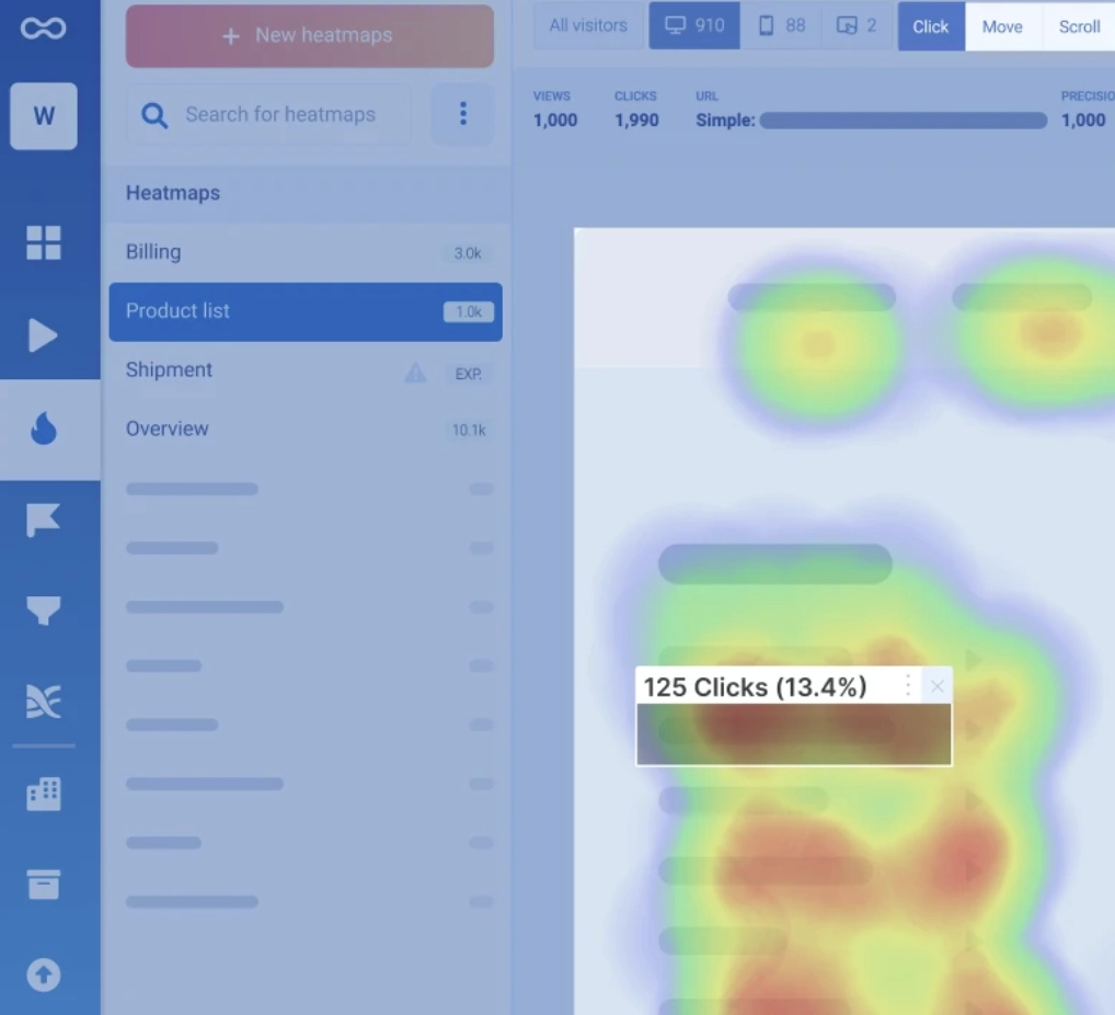
Figure 5: Smartlook click heatmap example.10
Real-life example:
CricHeroes, the world’s largest cricket network with nearly 17 million users, sought to gain deeper visibility into user interactions within its mobile application to enhance engagement and retention rates.
Previously limited in understanding user journeys and behavioral patterns, CricHeroes implemented Smartlook’s behavior analytics platform. Utilizing tools such as session recordings and event tracking, the team was able to pinpoint areas of friction, optimize onboarding processes, and refine key app features.
The insights gathered enabled more strategic personalization efforts and product improvements, ultimately contributing to stronger user retention and a more seamless user experience.
Results:
- Achieved an 11% increase in direct messaging activity between users through targeted onboarding and engagement optimizations.
- Enhanced the onboarding experience by identifying and supporting critical early-stage user behaviors.
- Improved the ability to segment and analyze user behavior across different cohorts.11
Hotjar
Hotjar specializes in heatmaps that reveal user interactions such as movement, clicks, and scrolling. This data helps identify areas of friction and highlights elements that attract or miss user attention.
Hotjar also enables behavior analysis both before and after changes, with saved heatmaps and charts tracking click trends over time.
The platform facilitates design optimization across desktop, mobile, and tablet devices by comparing user behavior and presenting engagement patterns in various formats.
Additionally, Hotjar’s feedback widget allows users to leave quick feedback, generating an average feedback score for each page and aiding in continuous site improvement.
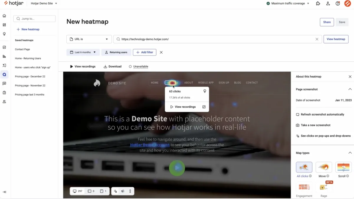
Figure 6: Hotjar’s heatmap creation dashboard.12
Real-life example:
Mizzen+Main, an American menswear brand, aimed to enhance the online shopping experience to increase conversions. By leveraging Hotjar’s Heatmaps and Session Recordings, their product team was able to identify key points of user frustration, such as high levels of rage clicks caused by the difficulty in navigating product color swatches.
After reformatting the swatches for better visibility and simplifying navigation, the company implemented further personalization based on user behavior insights.
These changes resulted in a smoother browsing experience, improved product discoverability, and significantly enhanced engagement and conversion metrics.
Results:
- 39% increase in add-to-cart clicks after improving product swatch navigation.
- 60% decrease in rage clicks, indicating reduced user frustration.
- 4% decrease in cart abandonment rates.
- 82% increase in product recommendation click-through rates by personalizing suggestions for new versus returning users.13
Fullstory
Fullstory’s autocapture feature automatically collects user interaction data without manual tagging, which allows for comprehensive behavioral insights.
Autocapture leverages AI to capture every user action, helping product teams identify issues and optimize experiences with tools such as heatmaps, session replays, and journey mapping. This helps reduce the need for manual monitoring and ensures privacy by excluding sensitive data.
Moreover, Fullstory utilizes AI for its Metric Insights feature to deliver important insights on the data that matters. It automatically identifies notable trends or anomalies in KPIs, presenting insights that enable businesses to quickly recognize and respond to significant patterns or shifts.
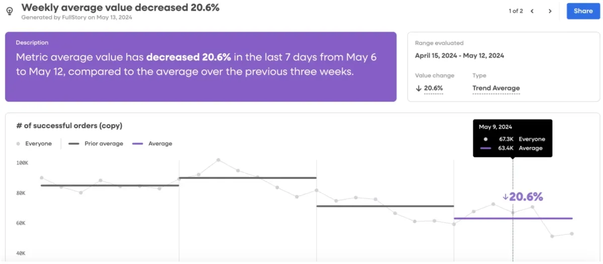
Figure 7: Fullstory metrics insights with AI dashboard.14
Real-life example:
Casumo, a leading online casino and sports betting operator in Europe, aimed to gain deeper behavioral insights to enhance player experiences and support faster, ROI-driven decision-making.
By implementing Fullstory’s tools, including Session Replay and Watched Elements, Casumo was able to monitor new UI releases, verify user-reported issues rapidly, and identify errors more efficiently.
These capabilities significantly improved operational efficiency and player satisfaction across key user journeys.
Results:
- 87% reduction in time to resolution for user-reported issues.
- 3.5 hours saved per issue identified and addressed.
- 50% faster detection of errors following new feature releases.15
Glassbox
Glassbox’s Insights Assistant, GIA, is an AI-powered tool that manages data analysis by capturing all user interactions and technical events on websites and mobile apps.
It provides instant and actionable insights through a chat-based interface that enables users to search and summarize sessions or reports quickly. GIA is designed to decentralize data access across teams, simplifying the understanding of user behavior, identifying friction points, and enabling data-informed decisions without requiring advanced technical skills.
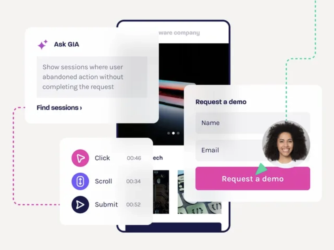
Figure 8: Glassbox Insights Assistant dashboard.16
Real-life example:
Money Mart Financial Services, a Canadian financial services company, wanted to understand how variations in homepage design affected customer engagement and conversion rates.
Through A/B testing two homepage versions, they used Glassbox’s Interaction Maps and Funnels to analyze user behavior and measure conversion performance across different designs.
By evaluating key engagement metrics, the team identified which variant was more effective at driving user actions, allowing them to make data-driven decisions about website design and maximize conversion opportunities.
Results:
- Estimated that sticking with the lower-performing variant could result in a potential loss of $101,400 in monthly revenue.
- Enabled faster, evidence-based decisions on homepage design to optimize user engagement and drive financial outcomes.17
Userpilot
Userpilot’s no-code event tracking feature helps product teams collect data on user interactions within applications. This feature enables event tracking without needing custom code.
The Event Autocapture feature automatically records all user interactions, such as clicks and form submissions, to provide a complete overview without manual tagging. No-code event tracking enables non-technical teams to customize which events to track, offering flexibility, real-time insights, and feature adoption metrics.
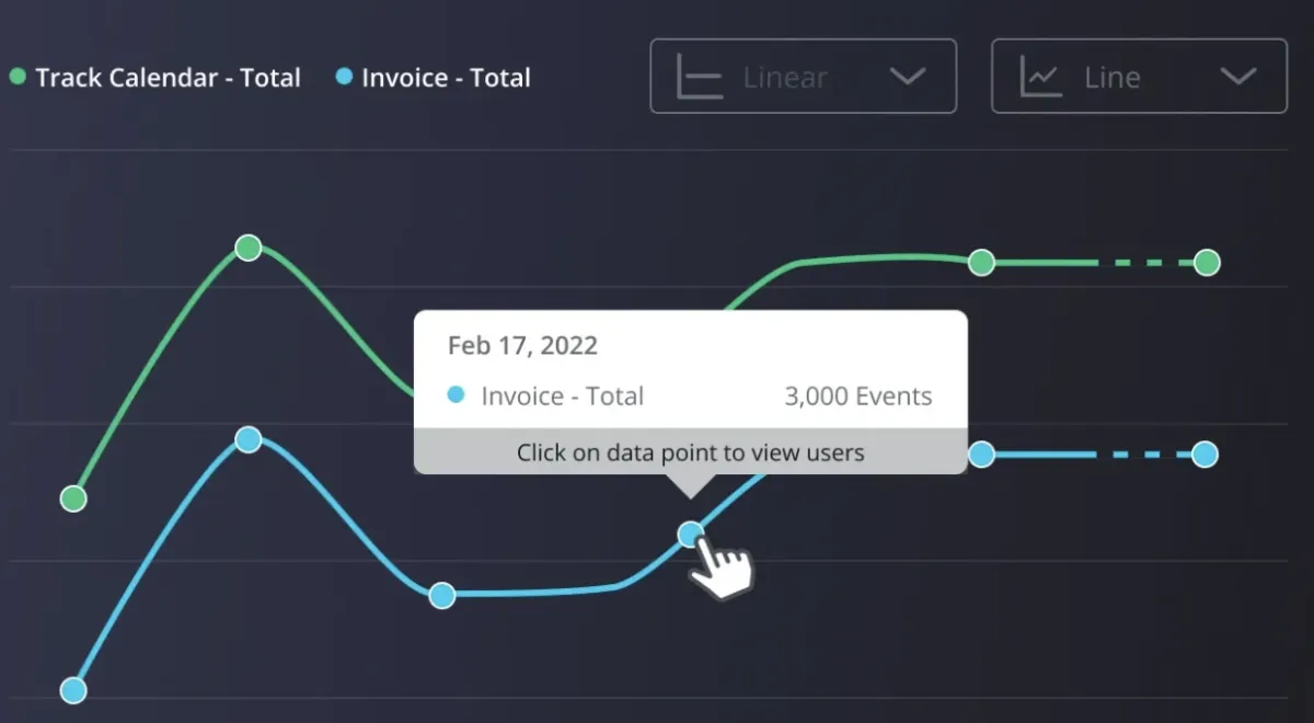
Figure 9: Userpilot’s trend analysis dashboard.18
Real-life example:
Smoobu, a platform for managing short-term vacation rentals, aimed to modernize its product and strengthen engagement with a less tech-savvy user base following its acquisition by HomeToGo.
Seeking a comprehensive and cost-effective product growth tool, they selected Userpilot for its onboarding, segmentation, A/B testing, and session replay capabilities.
By implementing a structured onboarding flow and testing its impact, Smoobu successfully guided users toward connecting rental channels more effectively.
They also leveraged localization and session replay features to enhance personalization and quickly address bugs.
Results:
- Achieved a 17% increase in channel connection conversions in the French market following onboarding optimizations.
- Improved user engagement through targeted onboarding flows triggered during initial user sessions.
- Enhanced support for a multilingual user base by utilizing Userpilot’s localization features.
- Accelerated issue resolution through session replay analysis to identify and fix user journey errors.19
Quantum Metric
Built on Google Cloud Platform’s Gemini Pro model, Felix AI summarizes customer sessions to improve the process of analyzing them.
With Felix AI, Quantum Metric can reduce the need to watch lengthy session replays. It allows users to quickly identify and measure the impact of friction points across their audiences. These insights can be integrated into existing workflows through built-in tools or a RESTful API to enable the sharing and use of session summaries.
Felix AI also acts as a resource for teams to ask specific questions about user sessions, to provide targeted insights, and support better decision-making.
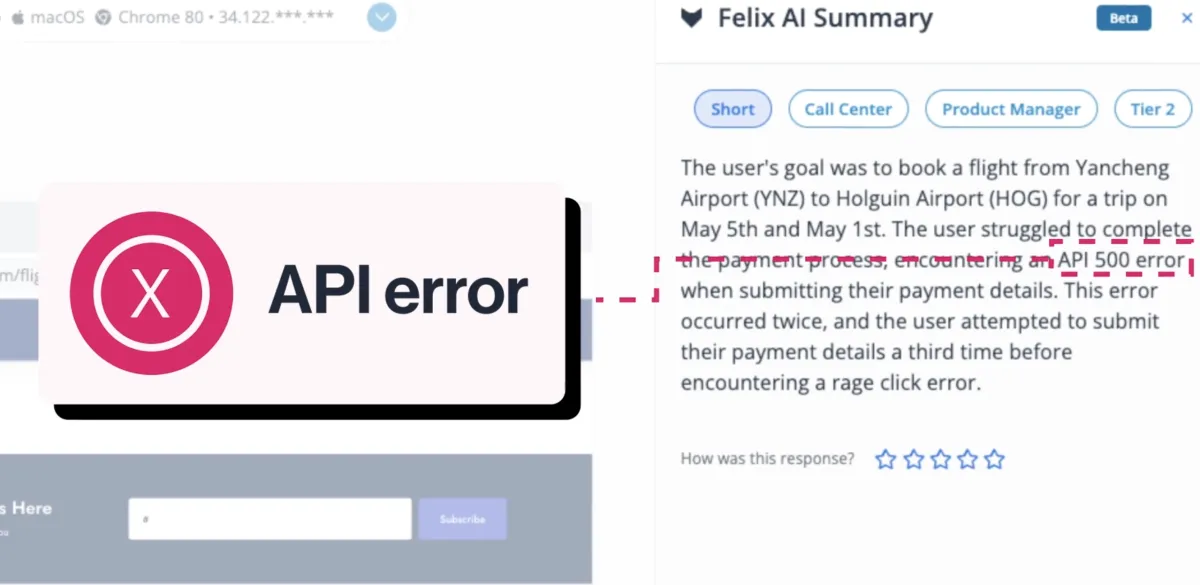
Figure 10: Quantum Metric’s Felix AI summary dashboard.20
Real-life example:
The American Medical Association (AMA), serving over 2 million users annually, faced challenges in optimizing its digital sign-in process, which was critical for accessing 20 AMA digital platforms.
Frequent login frustrations, stemming from API timeouts and system errors, were leading to high abandonment rates. By implementing Quantum Metric’s digital analytics and session replay tools, AMA’s customer experience, product, and IT teams were able to identify and prioritize key areas of friction.
Through a cross-functional agile approach, the organization reduced user frustrations, implemented rapid fixes, and enhanced the digital experience for members, improving access and boosting membership engagement.
Results:
- 21% decrease in user frustration due to improved UI and navigation.
- 67% reduction in user abandonment during the sign-in process.
- 76% decrease in platform errors after resolving technical issues.
- 140% increase in successful account creations and digital audience growth.
- 12% improvement in AMA membership sales.
- 51% increase in membership auto-renewal rates.21
What is product analytics?
Product analytics is essential for product and marketing teams to understand how users engage with digital products, including mobile apps and websites. By using product analytics tools, teams can track user interactions, analyze user behavior, and gather quantitative data on key metrics such as feature usage, customer retention, and user engagement.
With capabilities including event tracking, cohort analysis, session replay, and funnel analysis, product analytics tools give teams a complete understanding of how users navigate and interact with a product. This allows businesses to identify drop-off points, user needs, and customer pain points while driving improvements in the user experience.
Through path analysis, retention analysis, and impact analysis, product analytics software helps teams optimize product performance and deliver personalized experiences that increase customer satisfaction.
Customizable dashboards and interactive reports from product analytics software offer actionable insights and enable businesses to measure product success and drive growth. These tools enable teams to interpret data across various devices and tech stacks, providing a comprehensive view of the customer journey.
Whether analyzing user behavior or marketing strategies, these product analytics tools are critical for improving customer retention and delivering a seamless user experience. By leveraging deeper insights from machine learning and integrating with other tools, product teams can make data-driven decisions that enhance product usage and impact business performance.
Key features of product analytics software
Event tracking
Event tracking monitors specific user actions or interactions within a product. It helps businesses gain insights into how users engage with different features and areas of the product.
By collecting data on key events like clicks, page views, and purchases, businesses can analyze usage patterns and identify opportunities for product improvements or optimizations.
User segmentation
User segmentation involves categorizing users into distinct groups based on specific attributes, such as demographics or behavior. This allows businesses to tailor their marketing efforts and product experiences for different types of users.
Segmentation also helps in analyzing user behavior within each group, providing more targeted insights for growth strategies.
Funnel analysis
Funnel analysis examines the steps users take to complete specific goals, such as signing up or making a purchase.
By tracking the user journey through each stage, businesses can identify where users drop off and what problems they encounter. This analysis helps optimize processes and improve the overall conversion rate by addressing bottlenecks in the user experience.
Dashboards and reports
Dashboards and reports display key performance metrics and provide insights into product usage and engagement.
Dashboards present real-time data in a visual format for product teams to monitor performance, while reports offer more in-depth analyses of trends over time. Both tools are essential for keeping stakeholders informed and making data-driven decisions.
User behavior data analysis
User behavior data analysis focuses on understanding how users interact with a product over time by examining data from various sources like event tracking, heatmaps, or session recordings.
This analysis uncovers patterns in engagement and highlights areas where users may face challenges or where product improvements can be made to enhance the overall user experience.
Differentiating features of product analytics software
A/B testing
A/B testing, also known as split testing, is a method used in product analytics to compare two versions of a product, feature, or user experience.
A/B testing contributes to product analytics by allowing product teams to test different versions of a feature or change, measure user responses, and determine which version performs better. This helps optimize user experience, improve conversion rates, and reduce the risk of implementing changes that might negatively impact user behavior.
How does it work?
- Version creation: The team creates two versions of a feature: the original (Version A) and a modified version (Version B).
- User segmentation: Users are randomly divided into two groups. One group is shown Version A, while the other group sees Version B. The distribution is typically equal, but it can vary depending on the testing goals.
- Data collection: The product analytics tool collects data on user interactions with both versions. This data can include metrics like click-through rates, time spent on a page, purchase completions, or any other key performance indicators (KPIs).
- Statistical analysis: The tool analyzes the data to identify whether there is a significant difference in the performance of Version A and Version B.
- Results interpretation: If one version shows statistically significantly better results (e.g., higher conversions), the team can decide to roll out that version to all users.
Generative AI integrations
Generative AI integrations enable product analytics tools to help teams derive meaningful insights, automate data analysis, and improve decision-making processes. Here are some key integrations and applications of generative AI in product analytics:
- Natural Language Querying (NLQ): Users can ask questions in plain language and receive automatic insights and data visualizations.
- Automated insights: AI analyzes data patterns and generates summaries or recommendations for product improvements.
- Personalized recommendations: AI suggests product features or UX improvements based on user behavior and data.
- Automated reporting & data storytelling: AI generates automated reports with visualizations and narratives to summarize key findings.
- Prediction and scenario simulation: AI predicts outcomes and simulates scenarios to help decision-making based on product data.
- User behavior analysis and anomaly detection: AI identifies unusual user behavior and generates alerts or explanations for anomalies.
- Cohort analysis and segmentation: AI automatically creates user cohorts and suggests segmentations based on behavior patterns.
- User journey mapping and optimization: AI generates optimized user flows and suggests improvements for user journey efficiency.
- Conversational AI and AI chatbots: AI-powered chatbots gather feedback and summarize insights for product improvement.
Session replay/session recording
Session replay (also known as session recording) is a feature in product analytics tools that allows teams to capture and replay users’ interactions on a website or app. It records things like mouse movements, clicks, scrolling, form inputs, and page transitions. Here are the key components of session replay:
- Mouse movements and clicks: Tracks where the user moves their cursor and which buttons they click.
- Scrolling behavior: Shows how far down a page a user scrolls.
- Form inputs (with privacy considerations): Tracks how users interact with forms (although sensitive data like passwords is typically masked).
- Navigation paths: Tracks the series of pages or screens a user visits during their session.
- Device and browser environment: Captures details about the device, operating system, and browser the user is using, which can influence the user experience.
Session replay in product analytics is important for understanding how users interact with a product, revealing areas of difficulty, frustration, or confusion.
It helps troubleshoot bugs by allowing teams to see exactly what users experienced while making it easier to replicate and fix issues. By identifying where users drop off or struggle, session replays help improve conversion rates and optimize design.
They also validate user feedback, ensure compliance in regulated industries, and provide customer support teams with better context for resolving issues.
Heatmaps
In product analytics, heatmaps are visual tools that represent data with varying colors to show the frequency, intensity, or value of user interactions on a product’s interface. The colors typically range from cool (blues and greens) to warm (reds and yellows), where “hotter” colors indicate higher interaction levels, such as where users click, scroll, or spend the most time.
Here are different types of heatmaps in product analytics:
- Click heatmaps: Show where users click the most on a page. Areas with more clicks are represented by warmer colors.
- Scroll heatmaps: Indicate how far down users scroll on a page, showing which sections are getting the most and least engagement.
- Movement heatmaps: Track how users move their cursor across the screen, often used to infer eye movement and interest in different parts of the page.
- Attention heatmaps: Represent areas where users spend the most time reading or viewing, giving insight into the content that captures the most attention.
By understanding where users focus most of their attention, businesses can better position key content or features. Heatmaps can help identify dead zones or areas of the interface that users are ignoring, guiding design improvements.
When running A/B tests on different designs, heatmaps can provide qualitative data to validate quantitative results. They show how user behavior changes between variations to increase data-driven decision making.
Automation
Product analytics can benefit from a wide range of automation types that streamline data collection, analysis, and insights generation:
Data collection automation
- Event tracking: Automatically tracking user interactions such as clicks, scrolls, form submissions, and navigation.
- Data pipelines: Automating the flow of raw data from multiple sources (e.g., apps, websites) into a centralized analytics platform.
Insight generation
- Automated reports and dashboards: Creating regularly updated dashboards and reports with key metrics (e.g., retention rates, user engagement).
- Anomaly detection: Using AI/ML algorithms to automatically detect unusual patterns or outliers in product usage data.
- Predictive analytics: Automating forecasts for user behavior trends, such as churn predictions or feature adoption likelihood.
User journey analysis
- Funnel analysis automation: Automatically tracking and updating conversion funnels to show how users progress through different steps of a process.
- Path analysis: Mapping user journeys to identify common paths users take within an app or website.
External Links
- 1. Watchfinder Clocks 1,300% ROI Using Precision Remarketing With Google Analytics. ThinkwithGoogle
- 2. Session Replay and Experience Analytics | Amplitude. Amplitude
- 3. Increasing Conversion Rates at Ultra Mobile and Mint Mobile | Amplitude. Amplitude
- 4. Pendo Analytics | Product Analytics Tool - Product Analytics Software. Pendo
- 5. Cox Automotive steers its business forward with Pendo data | Pendo.io. Pendo
- 6. Chat with Sense: analytics for everyone | Heap.
- 7. How Atria used Heap to gain better insights and improve their user experience | Heap.
- 8. Spark AI | Mixpanel.
- 9. Customer - How Boll & Branch improved its website and increased online purchases using data | Mixpanel.
- 10. Heatmaps Tool (Heat map) | Smartlook. Smartlook.com, s.r.o.
- 11. How user journey insights helped CricHeroes improve their user engagement and retention rates | Smartlook Blog. Smartlook.com, s.r.o.
- 12. Visualize User Behavior With Click, Scroll, and Move Heatmaps.
- 13. How Mizzen+Main Increased Add-To-Carts by 39%.
- 14. Fullstory and AI: Maximizing behavioral data insights | Fullstory. Fullstory
- 15. Casumo enhances player experience and accelerates issue resolution with Fullstory | Fullstory. Fullstory
- 16. Meet GIA - The Glassbox Insights Assistant - Glassbox. Glassbox
- 17. Money Mart - AB Testing & Interaction Maps - Glassbox. Glassbox
- 18. Product Analytics Software - Userpilot.
- 19. Unlocking 17% More Conversions: Smoobu’s Success With Userpilot.
- 20. Felix AI | Quantum Metric.
- 21. Customer Story | American Medical Association.


Comments
Your email address will not be published. All fields are required.