Data governance tools enable organizations to manage and control their data assets across on-premises, multi-cloud, and software-as-a-service (SaaS) environments.
Based on product categories, focus areas, and user experiences shared in review platforms, here are the top 10+ data governance software that can help organizations capture and analyze data through discovery, classification, and benchmarking:
Category and focus
| Software | Category | Focus |
|---|---|---|
| Sentra | Data security | Data security posture management (DSPM) |
| Varonis | Data security | Data security posture management (DSPM) |
| OneTrust Data Governance | Data security | Data security posture management (DSPM) |
| Informatica Data Security Cloud | Data security | Data masking |
| Microsoft Purview Information Protection | Data security | Sensititve data discovery |
| Atlan | Data intelligence | Data cataloging |
| Alation Data Intelligence Platform | Data intelligence | Data cataloging |
| Apache Atlas | Data intelligence | Data cataloging |
| Databricks Data Intelligence Platform | Data intelligence | Big data processing |
| SAS Viya | Data intelligence | Data analytics |
| SAP Master Data Governance (MDG) | Master data management | – |
| Informatica Master Data Management Platform | Master data management | – |
Market presence
| Software | Average rating | # of employees |
|---|---|---|
| Sentra | 3.8 based on 100 reviews | 458 |
| Varonis | - based on - reviews | 2,371 |
| OneTrust Data Governance | 4.1 based on 26 reviews | 2,628 |
| Informatica Data Security Cloud | 4.0 based on 47 reviews | 5,654 |
| Microsoft Purview Information Protection | 4.5 based on reviews 47 | 244,900 |
| Atlan | 4.5 based on 84 reviews | 408 |
| Alation Data Intelligence Platform | 4.5 based on 38 reviews | 732 |
| Apache Atlas | 4.6 based on 16 reviews | 2,277 |
| Databricks Data Intelligence Platform | 4.6 based on 249 reviews | 9,280 |
| SAS Viya | 4.5 based on 1,112 | 12,000+ |
| SAP Master Data Governance (MDG) | 4.6 based on 258 reviews | 121,379 |
| Informatica Master Data Management Platform | 4.1 based on 29 reviews | 5,654 |
See focus areas of data governance software.
Data security software
- Data security posture management (DSPM)
- Sentra
- Varonis
- OneTrust Data Governance
- Data masking:
- Informatica Data Security Cloud
- Sensitive data discovery:
- Microsoft Purview Information Protection
Data security software aims to improve visibility into a company’s data and how it is used. These tools can secure data by masking, encrypting, and filtering sensitive information. See a detailed explanation of data governance tools with data security capabilities:
Sentra
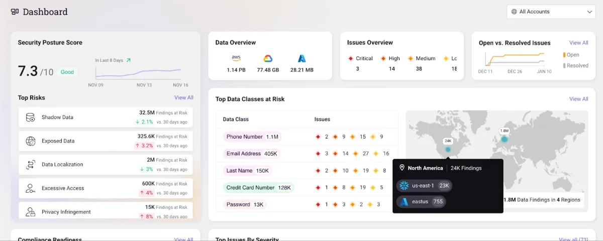
Sentra is an ideal choice for organizations that have distributed data across multiple IaaS and DBaaS environments. Sentra’s data lifecycle security platform enables you to apply data access restrictions to reduce unauthorized exposure risks, including:
- Excessive permissions
- Unauthorized access
- Inactive or unused identities
- Improper service and user provisioning and deprovisioning
With Senta organizations can:
- Maintain the least privileged access by monitoring access keys and user IDs to ensure that each employee has the necessary access permissions for their role and responsibilities within the organization.
- Manage third-party vendor access concerns by assigning different vendors varying levels of access, and identify third-party and cross-account access threats to sensitive data.
- Detect and block publicly accessible data assets by evaluating whether data assets are publicly accessible and take specific activities to proactively manage data access limits.
Data asset coverage:
- Detect PII, PCI, PHI, developer secrets, and more with a false positive rate of < 5% (claimed by Sentra).
- Label proprietary data, such as customer, HR, and intellectual property.
- Create your own data classes or utilize any of the 150+ built-in options.
Choose Sentra to secure and classify your cloud data.
Varonis
Varonis enables organizations to control who can access sensitive data and how they are utilizing it across multi-cloud, SaaS, and on-premises environments. Varonis’s data access governance capabilities include:
- Permissions analysis: Gives you an accurate picture of exactly what someone can access across nested groups, permissions, and inheritance.
- Audit trail: Gets you a complete history of files, folders, sites, permissions, mailboxes
- Automated remediation: Eliminate unnecessary permissions at scale.
Coverage:
- On-premise data & applications: Windows File Share, SharePoint, Exchange Server, UNIX/Linux, Oracle Solaris
- Cloud, SaaS, and laaS: Amazon S3, Aws, Google Drive, GitHub, Salesforce, GitHub, Slack, Okta, Zoom.
OneTrust Data Governance
OneTrust Data Governance combines data discovery and classification with an integrated data catalog and a suite of data governance policy management tools. It is part of OneTrust’s extensive product offering.
It uses a machine learning engine that can automatically identify apps and data repositories, inventory their data assets, and then classify, enrich, and tag datasets.
After that, OneTrust Data Governance may be used to create a data catalog and a detailed data dictionary, connect the catalog to a business glossary, and apply governance policies based on data classification.
OneTrust Data Governance includes the following features:
- With over 500 pre-built connectors and a drag-and-drop workflow builder, users can develop custom connectors.
- Functions for constructing data flow diagrams and producing regulatory compliance reports.
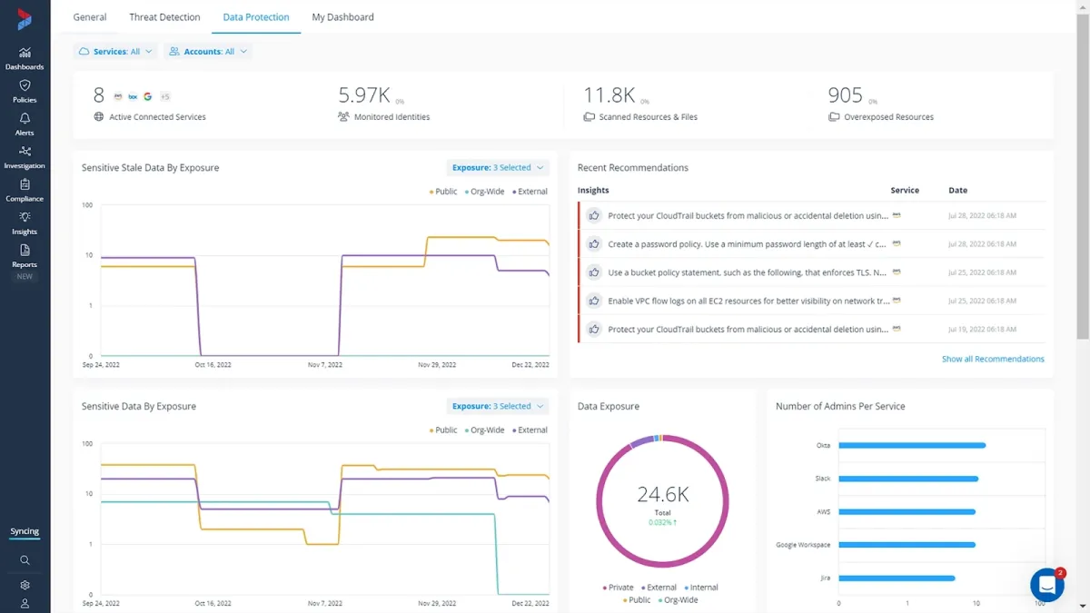
Informatica Data Security Cloud
Informatica Data Security Cloud is a cloud data governance and catalog tool. Key features include:
- Data privacy management: Categorize, and analyze all of your sensitive data.
- Cloud data masking: Protect authorized access and use of personal and sensitive information.
- Cloud test data management: Create non-production datasets for development purposes.
Microsoft Purview Information Protection
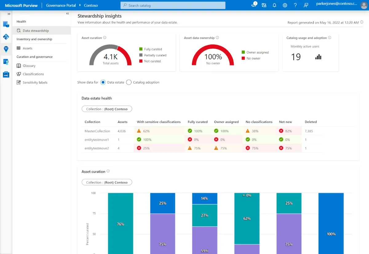
Microsoft Purview Information Protection is a strong voice for companies looking for a data governance tool with essential features (cataloging, compliance tagging, and basic lineage).
Key considerations:
- Coverage: The solution covers several data management features—data cataloging, lineage tracking, data stewardship, and compliance (PHI, retention).
- Integrations: It effectively integrates with Azure SQL databases and Power BI reporting. It provides deep integration with Azure services, which simplifies setup and management.
- Capabilities and pricing: It offers some free capabilities (e.g., for smaller SQL instances, and Power BI reports), but for the full feature set, you’ll need to plan for the scaling costs. However, the pay-as-you-go pricing model can quickly become expensive.
Data intelligence software
- Data cataloging
- Atlan for data cataloging
- Alation Data Intelligence Platform
- Apache Atlas
- Big data processing:
- Databricks Data Intelligence Platform for big data processing
- Data analytics:
- SAS Viya
Data intelligence is a technology that helps organizations answer six fundamental questions about data.” The questions are:
- Who is using which data?
- Where is the data, and where did it come from (lineage, provenance)?
- When is data accessible and last updated?
- Why do we have data? Why should we maintain (or remove) data?
- How is data used, or how should it be used?
- Relationships: What relationships exist between data and data consumers?
These data intelligence tools help to provide visibility into a company’s data and enable them to make more informed decisions. See data governance software focus on providing data intelligence:
Atlan
Atlan seems to be favored by organizations that value ease of use and a highly collaborative environment, but it might lack flexibility for more customization capabilities in complex infrastructures.
Pros:
- Collaboration features: Atlan seems to focus heavily on collaboration, making it easier for teams to work together on data projects, which is seen as an advantage over traditional data governance solutions.
- Integration: Atlan integrates well with several systems (including data lakes, warehouses, and BI tools) and supports automatic data lineage for many data sources.
Cons:
- Limited infrastructure management: Atlan might not be as flexible for organizations with complex, custom infrastructure requirements.
- Cost: Atlan would be a suitable product for companies with large budgets.
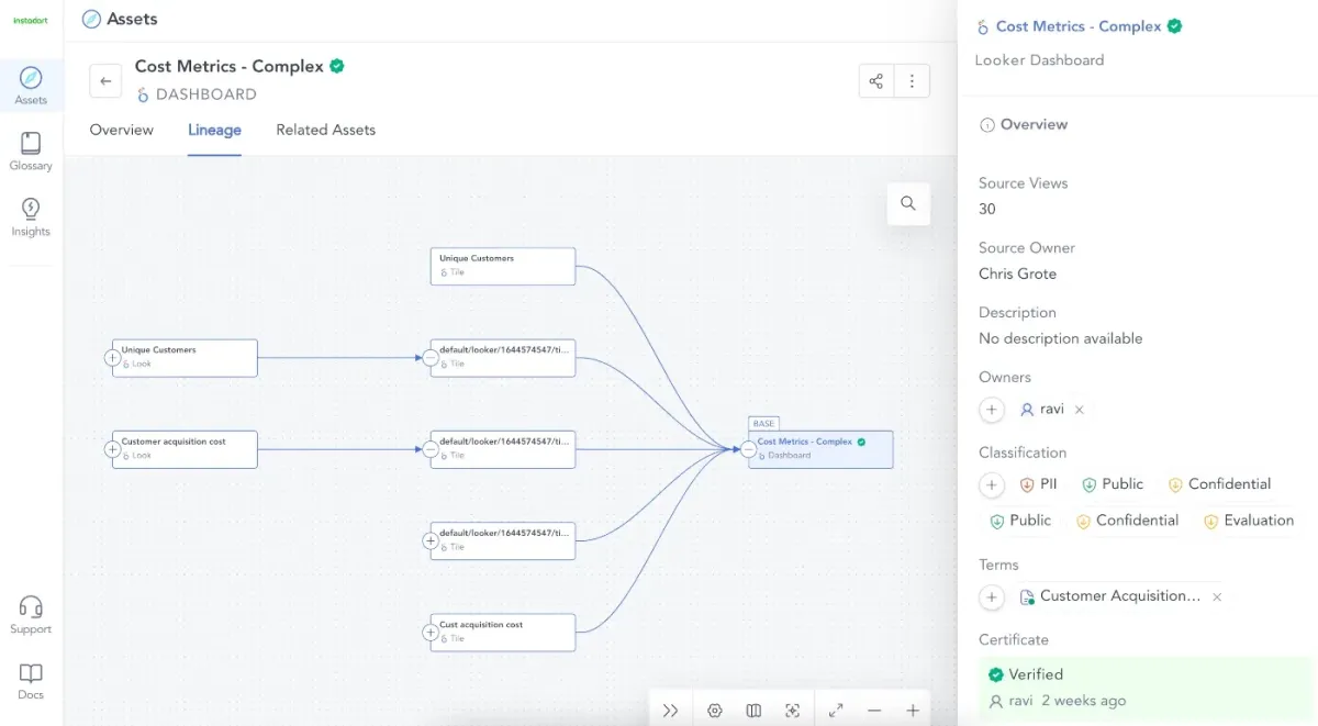
Alation Data Intelligence Platform
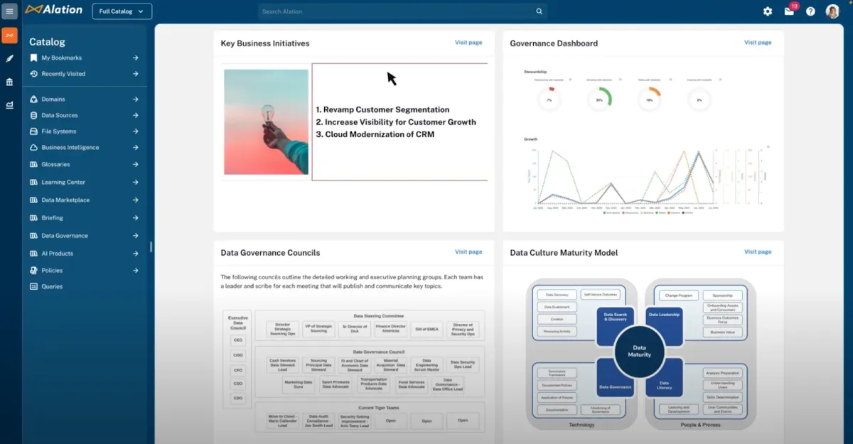
Alation Data Intelligence Platform aims to simplify the process of giving secure access to dependable data in IT systems, including on-premises and cloud platforms, or as a SaaS offering hosted on AWS.
Key features:
- Policy center: Its policy center feature allows organizations to establish governance policies and see how they’re applied to specific data assets.
- Data stewardship: The governance platform also includes a data stewardship feature, which automates data curation and employs AI and machine learning to identify potential data stewards based on data usage.
Apache Atlas
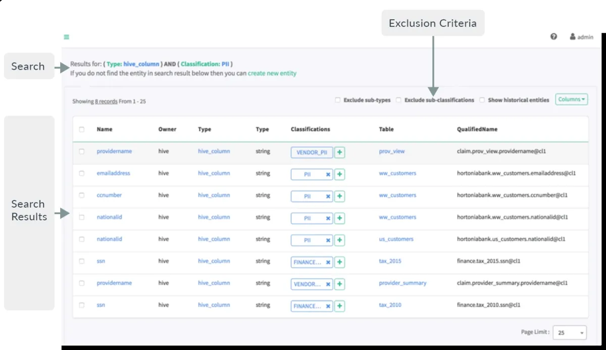
Apache Atlas is an open-source application that provides a basic set of metadata management and data governance capabilities for businesses that use data-intensive platforms.
It is primarily intended for use in Hadoop clusters, but it is capable of sharing metadata with tools and processes outside of the Hadoop ecosystem.
Atlas provides the following functionality:
- Storage of metadata through a Graph repository (JanusGraph).
- Querying and populating metadata via APIs (Rest API).
- Integration with the Apache Ranger data security framework to regulate access and data masking.
Databricks Data Intelligence Platform
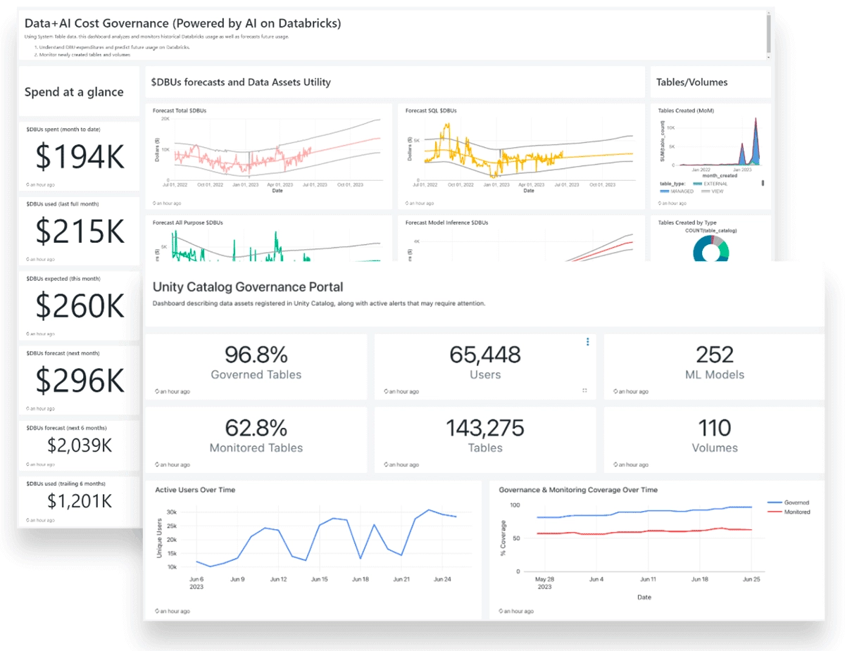
Databricks Data Intelligence Platform offers ‘Unity Catalog’ (see figure above) a fine-grained data and AI governance solution built on the Databricks platform. It simplifies the security and governance of your data and AI assets by offering a centralized location for administering and auditing access to them.
Unity Catalog integrates data engineering and data science tools, making it a great choice for teams who need to perform end-to-end analytics—from data ingestion to real-time analytics.
SAS Viya
SAS Viya is an analytics platform that offers strong data governance and security features. SAS Viya can integrate with other tools like Excel, Python, R, and big data platforms.
If your company is looking for advanced analytics (e.g., predictive modeling, customer behavior analysis, or demand forecasting) and has a large budget, SAS Viya could be a go-to tool to consider.
However, if your primary focus is on dashboarding and qualitative analysis simpler tools might be a better fit for your company.
Master data management software
- SAP Master Data Governance (MDG)
- Intelligent Master Data Management Platform
Master data management (MDM) software addresses this issue by allowing you to digitally connect and match similar records to construct correct entities across several domains and then effectively establish the relationships between them.
MDM solutions enable access to accurate views of master data and its relationships, allowing for faster insights, higher data quality, and compliance. See data governance tools particularly specialize in master data management:
SAP Master Data Governance (MDG)
SAP Master Data Governance is specifically developed to assist enterprises in governing and managing master data as part of their MDM operations. The software may be used to centralize and integrate master data from many source systems.
It is part of SAP’s Business Technology Platform, which includes data management, analytics, and artificial intelligence.
SAP provides two versions of the governance tool:
- one that works on top of its flagship S/4HANA ERP system,
- and a cloud edition
SAP Master Data Governance covers the following features:
- Prebuilt data models, business rules, governance workflows, and user interfaces.
- Duplicate check capabilities.
- Data replication functionality.
Informatica Master Data Management Platform
Informatica is widely used by large enterprises and is considered a solution for organizations with complex data governance needs. It is recognized for its maturity in the market.
With Informatica Master Data Management Platform organizations can leverage data governance, access, and privacy practices by:
- Connecting information to business context to provide a more comprehensive and transparent perspective.
- Gaining access to data sources and AI models for reliable insights that enable explainable and responsible AI.
- Viewing profiling statistics and scorecards from a single window to improve data quality and insights.
What is a data governance software?
Data governance software are solutions that assist companies in managing, controlling, and utilizing their data. These technologies include processes for ensuring data quality, integrity, security, and regulatory compliance, allowing enterprises to transform raw data into meaningful insights.
They are primarily utilized by data management professionals, business analysts, and IT departments to ensure consistency across datasets, streamline big data sources, and enable informed decision-making.
How do data governance tools help organizations?
Organizations use data governance tools to develop internal data standards and policies that govern who can access data and how it is used in company operations and analytics applications. These technologies frequently include data security posture management initiatives and master data management (MDM) ones.
Focus areas of data governance software
Data security posture management (DSPM)
Data governance tools with a DSPM focus manage data security posture comprehensively. It emphasizes securing data and mitigating risks. These technologies enable deep integrations for the discovery and classification of sensitive data across SaaS applications, cloud environments, and GenAI tools. These tools commonly utilize data security technologies such as:
- data detection and response (DDR)
- data loss prevention (DLP)
Data masking
Data masking tools, also known as data obfuscation tools, use encryption methods and techniques to change sensitive data so that it has little or little value to unauthorized intruders while remaining useful by software or authorized persons. Data masking is sometimes known as anonymization or tokenization.
Data cataloging
Data cataloging technologies prioritize data governance and management rather than data security. These tools have limited coverage (e.g. IaaS-only) compared to DSPM tools.
The tools typically found in a data catalog include:
- Data inventory
- Data governance policies
- Data discovery tools
- Data landscape mapping
Big data processing
Big data tools are software systems that can handle, process, and analyze enormous amounts of complex and diverse data, allowing businesses to gain useful insights for decision-making. These tools focus on:
- Enabling analysis of high-volume datasets in real-time.
- Optimizing resource allocation for data pipelines.
Data analytics
Data analytics-focused data governance software aims to ensure that the data utilized for analytics is accurate and follows corporate policies and regulatory standards. These technologies:
- Supports data quality
- Improves data accessibility
- Tracks data lineage
- Enforces policies
Benefits of data governance software
Inconsistencies in diverse systems throughout a company may not be handled until appropriate data governance is in place. For example, user accounts may exist across multiple formats in sales or finance databases. This may complicate data integration efforts or cause data integrity difficulties, reducing the accuracy of corporate reporting, or analytics systems.
Data governance tools enable companies to make the most of their data while avoiding operational or analytic challenges caused by discrepancies. Here are some core advantages:
- Centralized policies and systems reduce IT expenses associated with data governance.
- Data standards enable greater cross-functional decision-making and communication.
- Compliance audits and standards are simple to maintain.
- High visibility into data supports business intelligence for short and long-term planning, such as mergers and acquisitions.
- Stable data helps adjust to changing data and privacy rules.


Comments
Your email address will not be published. All fields are required.